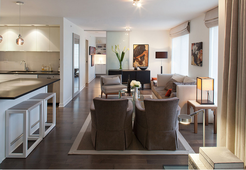
We were delighted to answer a few questions and share a few of our truths; Many thanks to Creators Vancouver and especially Liz, for their interest in the work of design office.
Showing posts with label process. Show all posts
April 3, 2018
April 13, 2017
Site Visit Beverly Hills
Various Instagram captured room details from our Beverly Hills residence project, site visit last week. With construction in the finishing stages we're very pleased with the way this one is coming together.
October 8, 2013
Interview on At Home
I had the pleasure of speaking with Cheryll Gillespie on her At Home radio show. We had a great lively chat about our professional practice, design philosophies, guiding principles and loving what we do! The interview runs about 12 mins, so get a coffee if you're interested.
March 15, 2013
Creed
![]() |
| RBI concept sketch for kitchen |
As I
approach my 35th year of being a professional interior designer, I am struck not by how much has changed, but rather by how much has
remained true. Ultimately an honest authentic
approach to design prevails for me. Our design point of view is formed
by our clients desires and informed by our core design values. Interior design that is driven by an elegant
expression of function, that does not care for trend or the latest colour.
I believe the enduring choices we make, will only increase in worth
as time goes by.
This year we've been designing a number of projects which will not come to fruition, long before fashion choices will have moved on. We'll share more of our thinking + processes here on the blog and on our new Facebook page, as they (+ we) progress.
"Modernism means freedom-freedom to mix, to choose, to change, to embrace the new but hold fast to what is good." Edward J Wormley 1907-1995.
October 26, 2012
Pattern + Texture
Even the most homogeneous element when viewed at close proximity, has richness and surface marking that make it anything but plain. We love the intimately revealed pattern of the simplest of materials. Most of the work we do relies on the quiet harmony and ornamentation of a diverse family of elements, to create visual interest.

For the bedroom pictured here, all of our choices were inspired by the natural world. Over a rustic oak plank floor we layered a woven woollen rug, and a Glant cashmere flannel covered bed. The Brent Comber Shattered (Douglas Fir) bench and custom walnut bedside tables add a more literal presence of nature. The room is draped with No. 9 Thompson raw linen embroidered with a large scale paisley repeat. We got a little louder with the bed dressing, organic chevron duvet cover from West Elm and Charlene Mullen pillows by Provide. Porta Romana Lava lamps appear to have captured precious sunlight, in 8.5 kg of watery mouth blown glass.
September 12, 2012
Lofty
In addition to the visual aesthetics we create, It occurs to me that one of the goals of interior design is unseen. Working towards the making of a place that emits an emotion of unity, where everything is alright with the world. Spaces that bring together past, present and room for the future, possessing a soul of their own. A lofty goal (for sure) but one worthy of pursuing in an attempt to achieve the simple feeling, of a perfect comfort ( both mental + physical ) in one's place of shelter.
The Interior Design Show West, takes place September 27-30 at the Vancouver Convention Centre. The show highlights the latest in furniture and interior design related products. Interior Designers of Canada is hosting the popular 'What's your design dilemma?', located at the IDC booth. Where registered interior designers provide a free (15 min.) consultation tackling attendees design challenges. Enjoy the show.
July 17, 2012
Schematic
When I began this on-line journal, my intention was to write about the firms activity, our processes and our results. To add more meaning to the images on our web site. It's proven to be quite an education. Words are not my natural method of communicating design thoughts. I'm much more comfortable using images. That's why drawing has been my premier tool when working with clients to construct the visual direction of their projects. This is especially true during our schematic design phase, it's a time of free associations, and rarely linear or methodical.
For the renovation of a ski resort property our design development presentation (sketches and collages) , starts to identify a point of view. We wanted to stray from the predictable alpine cliches, and grow our own concept of 'ski lodge'. Taking cues from diverse places and building in parts, to form a whole. This schematic direction can now be applied throughout our process and adopted into all our aesthetic decisions.
Noting this is my one hundredth blog entry, I look to the future + working to better articulate what we do, are doing, have done..... with visual assistance, of course!
October 12, 2011
Drift
I've been a fan of Bruce Mau Design (Massive Change) for many years. The work of his office allies both method and depth of information; culminating in beauty that is much more than skin deep. His thinking on design is just as thought provoking:
'Allow yourself to wander aimlessly. Explore adjacencies. Lack judgment. Postpone criticism.' # 8 Drift. from Bruce Mau's, Incomplete Manifesto for Growth. The design statement was written by Mau to outline his process, and serves (me) as a reminder to explore + enjoy the journey, not focusing on end results.
* Thinking like a designer, study + discourse;
The book Glimmer (written in collaboration with Mau) tackles the big questions of design while the Glimmer site, continues the conversation presenting design thinkers + thinking.
Images here; our schematic concept for a new sushi bar to be located in Opus Hotel Montreal.
August 1, 2011
Colour Study
As interiors designers we spend everyday, working in the laboratory of colour. The study and exploration of colour and it's application, is one of endless possibilities + lessons. Even our most subtle work (albeit muted) is about colour and how it conveys a point of view. In our much more expressive work (pictured here) rather than whisper, it shouts.
I love fully saturated colour and am always delighted to use it full strength, when the right opportunity presents its self. Colour selection always starts with emotion for me, theory defines and expands its execution. But mostly (I think) colour should be fun.
"He who wishes to become a master of colour must see, feel and experience each individual colour in its endless combinations with all other colours." (Johannes Itten)
The Art of Colour: The subjective experience and objective rationale of colour: by Johannes Itten.
June 10, 2011
Material Matters
The application of natural marble material to interior surfaces gives a strong sense of permanence, and each application is as individual as the stone it was quarried from. The inner beauty of marble is a continual source of wonder. Once cut from the earth each veneer is a one of a kind 'work of art'.
When specifying stone we tend to opt for more sober selections, after all it's a (very) long term decision (could be a lifetime). In addition it is imperative for us to individually select the slabs for every project, and equally, to engage the services of an expert fabricator/installer. If you're building for keeps, god really should be in the details.
Sequence cut marble slabs, as seen in the warehouse of Bordigon Marble and Granite, Vancouver, British Columbia.
April 21, 2011
Contextual
![]() |
| the scene |
Inspiration came from many sources, for our design of a home in Palm Springs. The desert landscape and context, furnished us with an exuberant array of colours and textures to draw from. Cactus blooms, lavender mountains at sunset, a diversity of palm trees and crystal blue skies, all (+ so much more) influenced the colour and patterns we selected. Fabric sources include, Schumacher, Designers Guild, Pollack and Donghia. Once completed these materials will transform our vintage treasures (found in situ) and our client's oasis in the desert will perfectly suit it's unique setting. We're looking forward to a fun installation in June!
![]() |
| fabric + paint selections |
April 8, 2011
Translation
The language of design, is decidedly not spoken by everyone. When we're presenting a design concept to clients one of the most effective means of crossing this language barrier is to prepare a sketch rendering. This tried and true visual tool, conveys our intentions while also helping us determine them (through the drawing process). Saving both time and design loops for all concerned.
Renovating a residence for a new client, required moving the kitchen to a different location in the home. This sketch with collage elements enabled us to get consensus, moving the detailed construction drawings forward with confidence, that we were all on the same page.
Design after all is a visual discourse.
May 11, 2010
The Plan's the Thing
When I approach a new project, armed with our client's wish list and functional requirements, everything starts with the plan. I try to work from a place without preconceptions, letting the program inform the space with meaning. Design enrichment's follow this form as it reveals it's self, and a fully resolved plan manifests into a concept. Planning provides the foundation of an intelligent three dimensional intention.
Given an existing master bathroom with defined peripheries (6 feet by 16 feet), we were asked to expand the functionality and render it in an elegant veneer. Rethinking the progression of activities, allowed for an expanded shower (wet room), separate toilet room, adding a make-up vanity plus a second sink. A limited material vocabulary that is simply detailed, unifies and expands the space.
All things considered luxury is not about scale, but comfort and ease.
Subscribe to:
Posts (Atom)